Various iterations of Schoolbox implementation for both Senior and Junior School who both have different UX needs which necessitated two styles linked together in colour for consistency
The Knox School’s weekly newsletter, introduced to replace printed publications and provide a central source of information for parents
A mid-term update to the existing school website to bring it up to scratch before going to market with a full redesign
Every year the school redoes its advertising style taking similar stylistic themes while updating them to keep it fresh and interesting.
We do a wide variety of advertising including print, web & large format billboards & digital signage. The following are the two styles I designed in 2020 and 2019
Presentation Night is the annual graduation celebration for the Year 12 students as well as a whole school event. I was tasked with creating a theme off a word and to then design a programme & backing digital assets for the show.
This is from the 2018 presentation night where the theme was Fly
The single largest piece of work done throughout the year, completed over a period of 5 weeks consisting of collection, collation and production of final art work. Majority being custom made spreads.
The aim was to create something that people would want to pick up and read even if they knew nothing of the school while still maintaining a classy feel.
The Falcon is a publication released once a term, through term 1-3. Its aim is to catch parents up what’s happened through the terms as well as provide them with a pleasant & easy to digest piece of media
The one from here is the term 2 edition of 2019 featuring a photo taken by me of the 2019 production of Antigone
The Chronicle is a once yearly, mid year magazine. It’s a more casual document than the Yearbook and is intended as a midway point between The Falcon and The Chronicle.
It is designed to be vibrant, bright and in your face but still maintain a professional look. This is the 2019 edition.
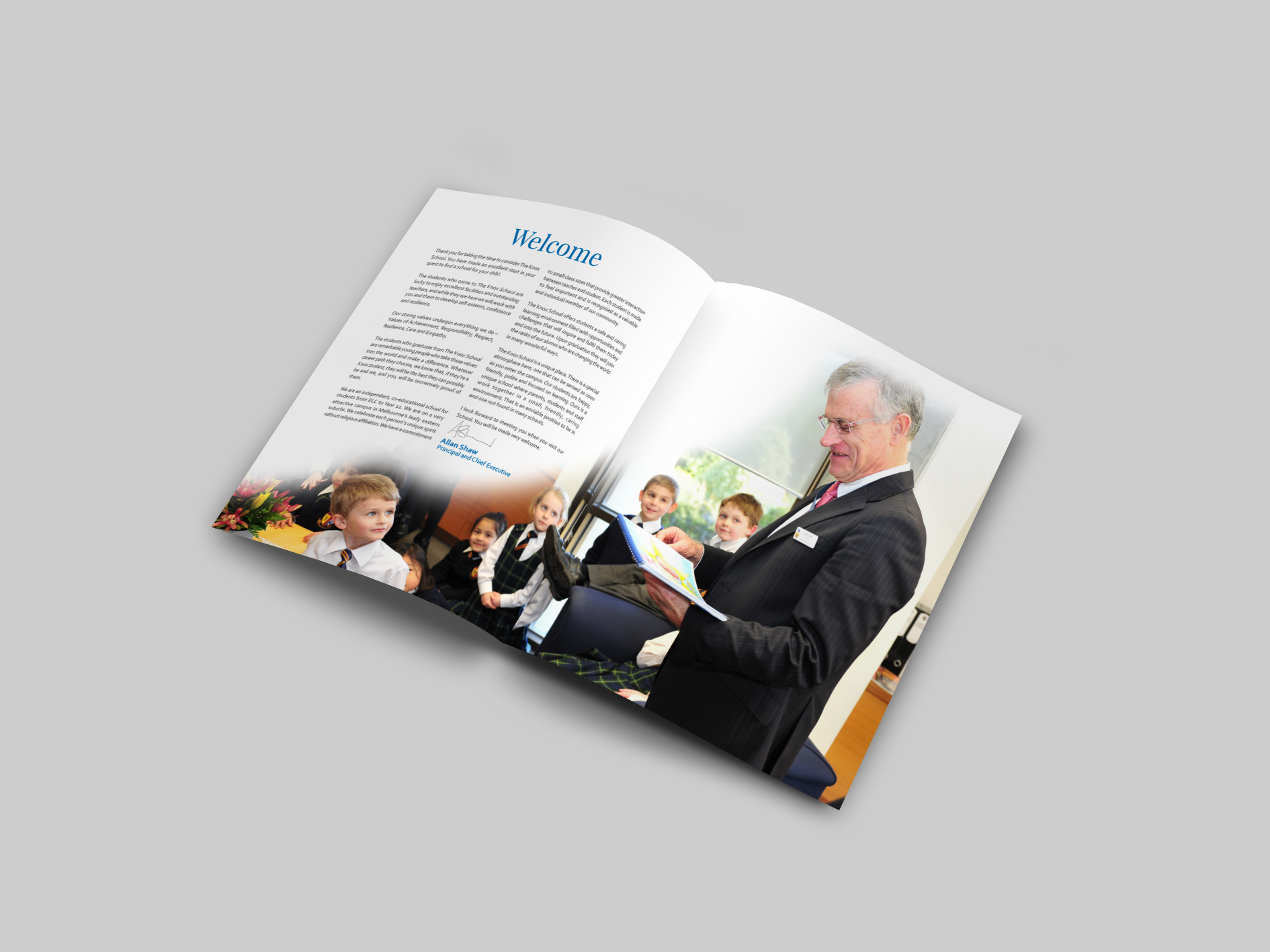
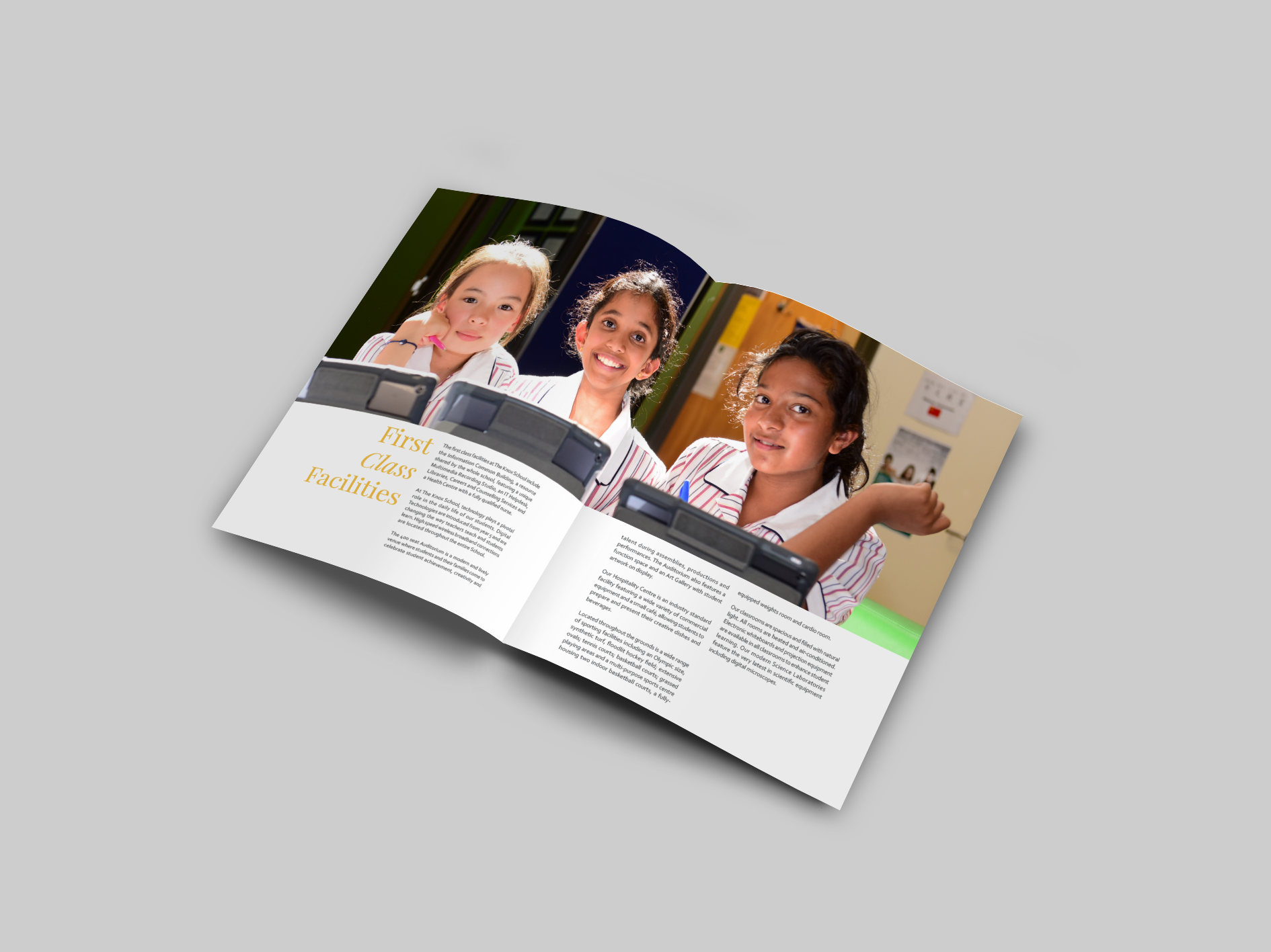
The Prospectus is a multi faceted document designed to show parents the opportunities made available to them at the school but also to interest and grab the attention of the prospective children who will be attending the school.
It comes in two versions, an English one and a simplified Chinese one, we also designed a personalized version which includes the prospective parents names in the introductory letter from the Principal
The design featured here is one of many of similarly styled sub-school and whole school information booklets, they include clearly laid out information along with pictures to keep the pages turning and to break up the sometimes lengthy pieces of information into more digestible blocks.
This one happens to be the Middle School Handbook, a document explaining the mechanisms, rules and regulations of the Middle School.
The Uniform Posters are posters that were commissioned from gender neutral student illustrations I did for The Record Book showing the correct way to wear the School uniform.
The Record Book is effectively a diary but also includes a range of legally required documents inside at the start including but not limited to, child safety documents, excursion disclaimers, school media policy etc.
Inside they’re a relatively simple, repetitive document but outside every year I designed a series of covers for each School House that got to be a bit out of the ordinary. Featured are the 2020 covers.